IEEE Trans. Visualization & Comp. Graphics (Proc. InfoVis), 2011

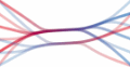
Views of a subset of GitHub follower data on the United States west coast. As a reference, from bottom to top, the node clusters in these maps are: San Diego and Los Angeles, San Francisco, Portland, Seattle and Vancouver. Edges fade from blue to red along their length to indicate direction. Divided edge bundling reveals connections to the San Francisco area as having an asymmetry: more blue bundles leave the area than red bundles leave.
Abstract
The node-link diagram is an intuitive and venerable way to depict a graph. To reduce clutter and improve the readability of node-link views, Holten & van Wijk's force-directed edge bundling employs a physical simulation to spatially group graph edges. While both useful and aesthetic, this technique has shortcomings: it bundles spatially proximal edges regardless of direction, weight, or graph connectivity. As a result, high-level directional edge patterns are obscured. We present divided edge bundling to tackle these shortcomings. By modifying the forces in the physical simulation, directional lanes appear as an emergent property of edge direction. By considering graph topology, we only bundle edges related by graph structure. Finally, we aggregate edge weights in bundles to enable more accurate visualization of total bundle weights. We compare visualizations created using our technique to standard force-directed edge bundling, matrix diagrams, and clustered graphs; we find that divided edge bundling leads to visualizations that are easier to interpret and reveal both familiar and previously obscured patterns.
Citation