IEEE Trans. Visualization & Comp. Graphics (Proc. VIS), 2021
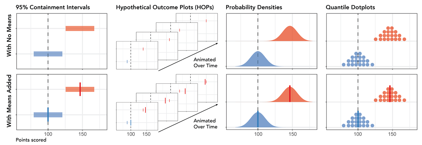
Visualization designs evaluated in the experiment.
Abstract
Uncertainty visualizations often emphasize point estimates to support magnitude estimates or decisions through visual comparison. However, when design choices emphasize means, users may overlook uncertainty information and misinterpret visual distance as a proxy for effect size. We present findings from a mixed design experiment on Mechanical Turk which tests eight uncertainty visualization designs: 95% containment intervals, hypothetical outcome plots, densities, and quantile dotplots, each with and without means added. We find that adding means to uncertainty visualizations has small biasing effects on both magnitude estimation and decision-making, consistent with discounting uncertainty. We also see that visualization designs that support the least biased effect size estimation do not support the best decision-making, suggesting that a chart user's sense of effect size may not necessarily be identical when they use the same information for different tasks. In a qualitative analysis of users’ strategy descriptions, we find that many users switch strategies and do not employ an optimal strategy when one exists. Uncertainty visualizations which are optimally designed in theory may not be the most effective in practice because of the ways that users satisfice with heuristics, suggesting opportunities to better understand visualization effectiveness by modeling sets of potential strategies.
Materials
Citation