Mosaic: An Architecture for Scalable & Interoperable Data Views
Abstract
Mosaic is an architecture for greater scalability, extensibility, and interoperability of interactive data views. Mosaic decouples data processing from specification logic: clients publish their data needs as declarative queries that are then managed and automatically optimized by a coordinator that proxies access to a scalable data store. Mosaic generalizes Vega-Lite’s selection abstraction to enable rich integration and linking across visualizations and components such as menus, text search, and tables. We demonstrate Mosaic’s expressiveness, extensibility, and interoperability through examples that compose diverse visualization, interaction, and optimization techniques—many constructed using vgplot, a grammar of interactive graphics in which graphical marks act as Mosaic clients. To evaluate scalability, we present benchmark studies with order-of-magnitude performance improvements over existing web-based visualization systems—enabling flexible, real-time visual exploration of billion+ record datasets. We conclude by discussing Mosaic’s potential as an open platform that bridges visualization languages, scalable visualization, and interactive data systems more broadly.
Introduction
Though many expressive visualization tools exist, scalability to large datasets and interoperability across tools remain challenging [
As a concrete example, consider the Vega [
We propose a standardized middle-tier
architecture that mediates data-driven components and backing data sources.
A common layer between databases and components can coordinate linked selections and parameters among views, while providing automatic query optimizations for greater scalability.
We focus on the Web browser as the primary site of rendering and interaction, and seek to coordinate diverse components via standard protocols for communicating data needs, dynamic parameters, and linked selection criteria.
We contribute Mosaic, an architecture for interoperable, data-driven components—including visualizations, tables, and input widgets—backed by scalable data stores.
A key idea of Mosaic is to decouple data processing from specification.
Mosaic Clients communicate their data needs as declarative queries.
A central Coordinator manages these queries, applies automatic optimizations, and pushes processing to a backing Data Source (by default DuckDB [
A main contribution of Mosaic is to unify the abstractions of popular visualization toolkits with scalable visualization techniques.
Individual clients may perform local optimization in their generated queries.
Meanwhile, the Mosaic Coordinator optimizes over multiple views and interaction cycles by caching, consolidating similar queries, and building data cube indexes for linked selections over aggregated data.
We present a novel indexing approach that extends prior work on imMens [
We demonstrate Mosaic’s extensibility and interoperability by developing both data-driven input widgets and vgplot, a grammar of interactive graphics in which graphical marks are Mosaic clients. Marks in vgplot push filtering, binning, aggregation, and regression transformations to a backing database. Interactors for pan/zoom, point, and interval selections produce dynamic queries mediated by Mosaic Params and Selections. Akin to Vega-Lite, Mosaic users can write portable, declarative specifications that can be generated by various languages and integrated in computational notebooks.
To assess scalability, we present benchmark results for both static and interactive visualizations. Mosaic outperforms Vega, VegaFusion, and Observable Plot, typically by one or more orders of magnitude. For the static cases, DuckDB performance and client-level optimization account for the bulk of Mosaic’s benefits. In the interactive cases, Mosaic’s automatic data cube indexing enables real-time interaction with billion+ record datasets. We conclude by discussing limitations and Mosaic’s use as a platform for research and development.
Related Work
Mosaic seeks to unify prior work on scalable visualization methods with expressive languages and tools for interactive visualization.
Scalable Visualization
Methods for scaling visualizations to larger datasets include sampling, fitting parametric models, and binned aggregation (potentially with smoothing).
While valuable, both sampling and modeling are lossy, and so may fail to preserve structures and outliers of interest.
Other methods focus on interactive visualization, supporting efficient updates for filtering and (re-)aggregation.
Nanocubes [
The Mosaic architecture supports indexing, prefetching, and other optimizations.
Most notably, Mosaic’s Coordinator analyzes client queries and linked selections to determine if pre-aggregated indexes are applicable; if so, it prefetches data cubes automatically.
In contrast to prior work, our implementation supports aggregations beyond count (e.g., sum, avg, min, max), uses sparse indexes that scale to larger datasets, and caches data cubes in a backing database for reuse.
Kyrix [
Visualization Languages and Tools
Commercial systems, including Tableau (previously Polaris [
Multiple research systems focus on linked interactions across views.
Snap-Together visualization [
Meanwhile, open-source tools inspired by Wilkinson’s Grammar of Graphics [
Moreover, these languages were not designed to handle millions of data points. For greater scale, VegaFusion [
Mosaic is an open, middle-tier architecture that higher-level languages such as ggplot2, Vega-Lite, or Observable Plot could target. Using a shared architecture, a visualization grammar could readily interoperate with other libraries, including input components and other visualization tools. We demonstrate this through the design of both input widgets and vgplot, a Mosaic-based grammar of interactive graphics that combines concepts from existing visualization tools.
Mosaic offers scalability by proxying queries to a backing database, and supports interaction by standardizing and generalizing Vega-Lite-style selections. Compared to Vega-Lite, Mosaic selections are decoupled from input event handling and support more complex resolution strategies. A single Mosaic selection may combine predicates provided by a variety of diverse views and input techniques. Mosaic selections can also synthesize different predicates for different views (clients), enabling complex coordination behaviors such as cross-filtering.
The Mosaic Architecture
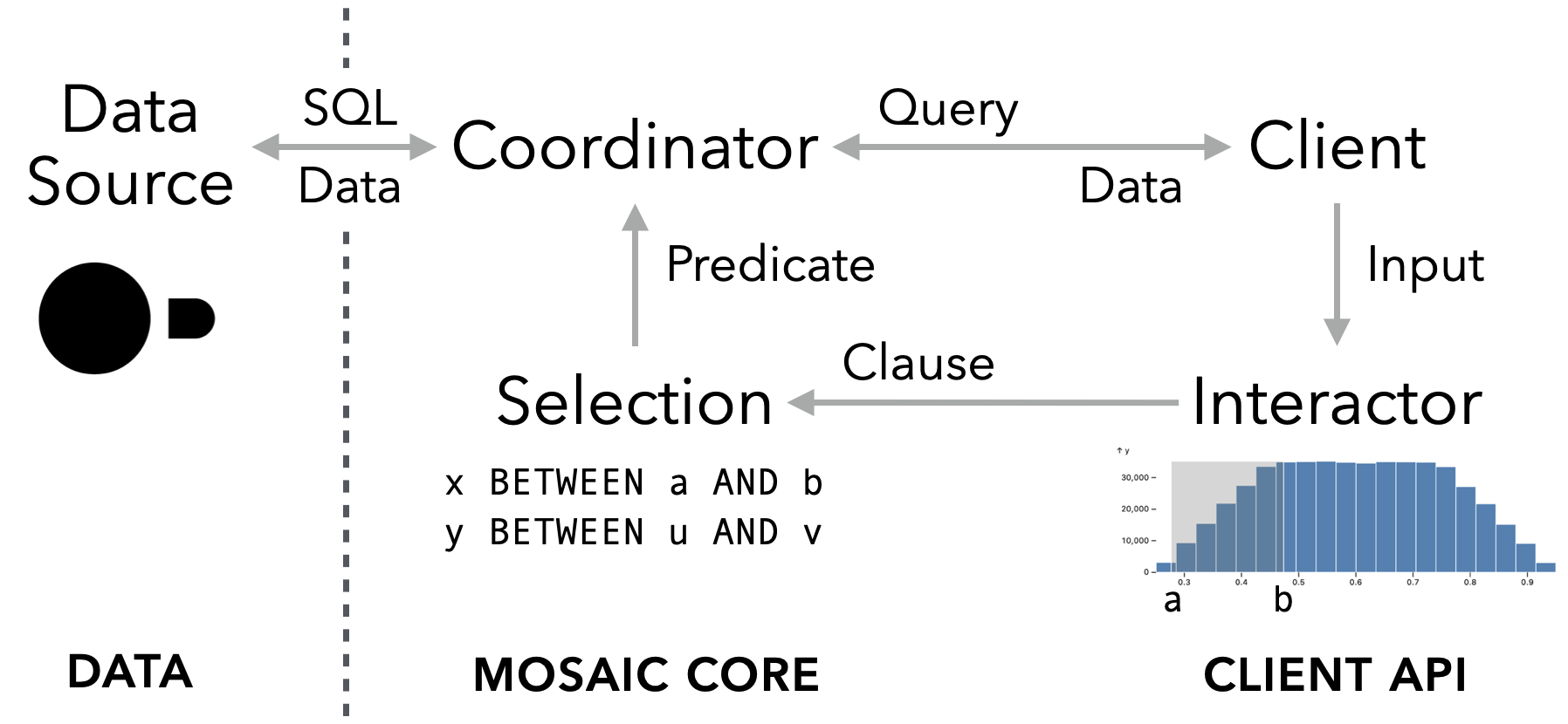
A Mosaic application consists of data-consuming Clients registered with a central Coordinator. Clients publish their data needs as declarative queries. A Coordinator manages these queries, performs potential optimizations, submits queries to a backing Data Source, and returns results or errors back to clients. Interactions among components are mediated by Params and Selections, reactive variables for scalar values and query predicates, respectively.
Though various query languages might be used, given the ubiquity of the relational data model and the availability of scalable databases, we focus on SQL (Structured Query Language). Our reference implementation uses DuckDB [
Clients
Mosaic Clients are responsible for publishing their data needs and performing data processing tasks—such as rendering a visualization—once data is provided by the Coordinator. Clients typically take the form of Web (HTML/SVG) elements, but are not required to.
fields() method to request an optional list of fields, consisting of table and column names as well as statistics such as the row count or min/max values. The Coordinator queries the Data Source for requested metadata (e.g., column type) and summary statistics as needed, and returns them via the client fieldInfo() method.
Next, the Coordinator calls the client query() method. The return value may be a SQL query string or a structured object that produces a query upon string coercion. Mosaic includes a query builder API that simplifies the construction of complex queries while enabling query analysis without need of a parser. The query method takes a single argument: an optional filter predicate (akin to a SQL WHERE clause) indicating a data subset. The client is responsible for incorporating the filter criteria into the returned query. Before the Coordinator submits a query for execution, it calls queryPending() to inform the client. Once query execution completes, the Coordinator returns data via the client queryResult() method or reports an error via queryError().
Clients can also request queries in response to internal events. The client requestQuery(query) method passes a specific query to the Coordinator with a guarantee that it will be evaluated.
The client requestUpdate() method instead makes throttled requests for a standard query(); multiple calls to requestUpdate() may result in only one query (the most recent) being serviced.
Finally, clients may expose a filterBy Selection property. The predicates provided by filterBy are passed as an argument to the client query() method.
Coordinator
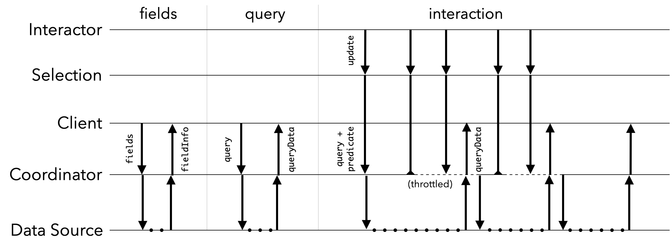
The Coordinator is responsible for managing client data needs. Clients are registered via the Coordinator connect(client) method, and similarly removed using disconnect(). Upon registration, the event lifecycle begins. In addition to the fields and query calls described above, the Coordinator checks if a client exposes a filterBy property, and if so, adds the client to a filter group: a set of clients that share the same filterBy Selection. Upon changes to this selection (e.g., due to interactions such as brushing or zooming), the Coordinator collects updated queries for all corresponding clients, queries the Data Source, and updates clients in turn. This process is depicted in
As input events (and thus Selection updates) may arrive at a faster rate than the system can service queries, the Coordinator also throttles updates for a filter group. If new updates arrive while a prior update is being serviced, intermediate updates are dropped in favor of the most recent update. The Coordinator additionally performs optimizations including caching and data cube indexing, detailed later in
Data Source
The Coordinator submits queries to a Data Source for evaluation, using an extensible set of database connectors. By default Mosaic uses DuckDB as its backing database and provides connectors for communicating with a DuckDB server via Web Sockets or HTTP calls, with DuckDB-WASM in the browser, or through Jupyter widgets to DuckDB in Python. For data transfer, we default to the binary Apache Arrow format [
Params and Selections
Params and Selections support cross-component coordination. Akin to Vega’s signals [value property) and broadcast updates upon changes. Params can parameterize Mosaic clients and may be updated by input widgets.
The Mosaic architecture is agnostic as to where Param and Selection updates come from. As we will illustrate later, updates may be initiated by clients themselves or by dedicated interactor components.
A Selection is a specialized Param that manages one or more predicates (Boolean-valued query expressions), generalizing Vega-Lite’s selection abstraction [column BETWEEN 0 AND 1), a corresponding value (e.g., the range array [0,1]), and an optional schema providing clause metadata (used for optimization, see value property to return the active clause value, making Selections compatible where standard Params are expected.
Selections expose a predicate(client) function that takes a client as input and returns a correponding predicate for filtering the client’s data. Selections apply a resolution strategy to merge clauses into client-specific predicates. The single strategy simply includes only the most recent clause. The union strategy creates a disjunctive predicate, combining all clause predicates via Boolean OR. Similarly, the intersect strategy performs conjunction via Boolean AND. Any of these strategies may also crossfilter by omitting clauses where the clients set includes the input argument to the predicate() function. This strategy enables filtering interactions that affect views other than the one currently being interacted with.
Both Params and Selections support value event listeners, corresponding to value changes. Selections additionally support activate events, which provide a clause indicative of likely future updates. For example, a brush interactor may trigger an activation event when the mouse cursor enters a brushable region, providing an example clause prior to any actual updates. As discussed in
Extensibility and Interoperability
As a middle-tier architecture, Mosaic is designed to be extensible for both practical purposes and research experimentation.
The Client API was carefully designed to offload all query management responsibility to the Coordinator. As a result, Coordinator-specific optimizations (
While our implementation primarily targets SQL, DuckDB, and Apache Arrow, any of these pieces might be replaced. We strive to use standard SQL constructs, enabling other relational databases. Clients can use alternative query languages if an augmented Coordinator and Data Source support them. Similarly, other data transfer formats could be used, so long as the result either conforms to standard JavaScript iterables or the clients involved can handle the specialized format.
Mosaic is intended to support integration across a variety of diverse clients. In the next sections, we demonstrate how both standard input widgets and a full grammar of interactive graphics can be implemented and flexibly interoperate using the Mosaic API. In the future these could be further augmented with clients for custom visualization tasks (e.g., graph drawing) and rendering methods (e.g., 3D WebGL views).
Mosaic Input Components
Inspired by Observable’s inputs package [menu, search, and table components, while slider component.
The slider, menu, and search inputs support dual modes of operation: they can be manually configured or they can be backed by a database table. If a backing table and column are specified, the slider’s query() method gets the minimum and maximum column values to parameterize the slider. The menu and search components instead query for distinct column values, and use those to populate the menu or autocomplete options (
All input widgets can write updates to a provided Param or Selection. Param values are updated to match the input value. Selections are provided a predicate clause (
The table component provides a sortable, scrollable table grid view. If a set of backing columns is provided, the table fields() method requests metadata for those columns. If a backing table is provided without explicit columns, fields() instead requests all table columns. The returned metadata is used to populate the table header and guide formatting and alignment by column type.
To limit data transfer, the table query() method requests rows in batches using SQL LIMIT and OFFSET clauses.
As a user scrolls the table, the requestQuery() method is used to request a new batch with the proper offset.
To reduce latency, the component further requests that the Coordinator prefetch the subsequent data batch.
Table components are sortable (requestQuery() is called to fetch a sorted data batch. As a user scrolls, these sort criteria persist.
If provided, the filterBy Selection is used to filter table content.
vgplot: An Interactive Visualization Grammar
To demonstrate extensibility and interoperability in Mosaic,
we developed vgplot, a grammar of graphics [
Plot Elements
A plot is a visualization in the form of a Web element.
As in other grammars, a plot consists of marks—graphical primitives such as bars, areas, and lines—that serve as chart layers.
Each plot includes a set of named scale mappings such as x, y, color, opacity, etc.
Plots can facet the x and y dimensions, producing associated fx and fy scales.
Plots are rendered to SVG output by marshalling a specification and passing it to Observable Plot.
A plot is defined as a list of directives defining plot attributes, marks, interactors, or legends.
Attributes configure a plot (width, height) and its scales (e.g., xDomain, colorRange, yTickFormat).
Attributes may be Param-valued, in which case a plot updates upon Param changes.
vgplot also introduces a Fixed scale domain setting (e.g., xDomain(Fixed)), which instructs a plot to first calculate a scale domain in a data-driven manner, but keep that domain fixed across subsequent updates.
Fixed domains prevent disorienting scale domain jumps
that hamper comparison across filter interactions (a limitation of Vega-Lite).
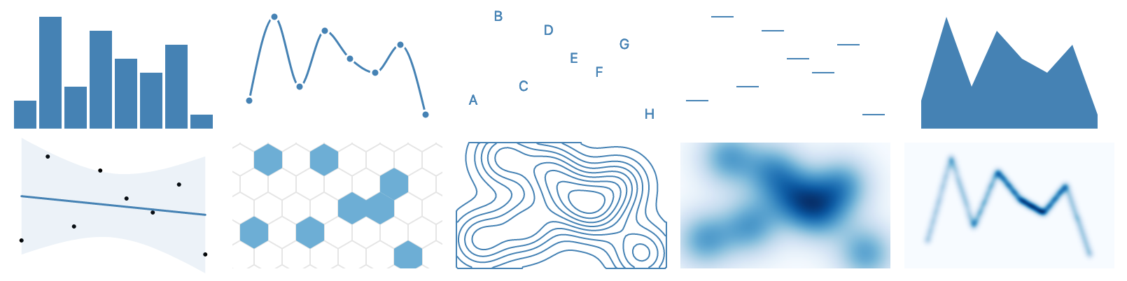
bar, line, text, tick, area; regression, hexbin, contour, raster, and denseLine.Marks are graphical primitives, often with accompanying data transforms, that serve as chart layers.
Each vgplot mark is a Mosaic client that produces queries for needed data.
x, y, fill, and stroke) that can encode data fields.
A data field may be a column reference or query expression, including dynamic Param values.
Common expressions include aggregates (count, sum, avg, median, etc.), window functions (e.g., moving averages), date functions, and a bin transform.
Field expressions are specified using Mosaic’s SQL builder methods.
Basic marks—such as dot, bar, rect, cell, and text—mirror their namesakes in Observable Plot [barX and rectY indicate spatial orientation and data type assumptions. For example, barY indicates vertical bars—continuous y over an ordinal x domain—whereas rectY indicates a continuous x domain.
Basic marks follow a straightforward query() construction process:
Iterate over all encoding channels.
If no aggregates are found, SELECT all fields directly.
If aggregates are present, include non-aggregate fields as GROUP BY criteria.
If provided, map the filter argument to a WHERE clause.
For more details on query generation, see Appendix A.
areaY mark uses M4 optimization [The area and line marks connect consecutive sample points. areaY, lineX) apply M4 optimization [query() method determines the pixel resolution along the major axis and performs perceptually faithful, pixel-aware binning of the series, limiting the number of drawn points.
This optimization offers dramatic data reductions, potentially spanning multiple orders of magnitude.
The regression mark (query(). The mark then draws regression lines and confidence intervals.
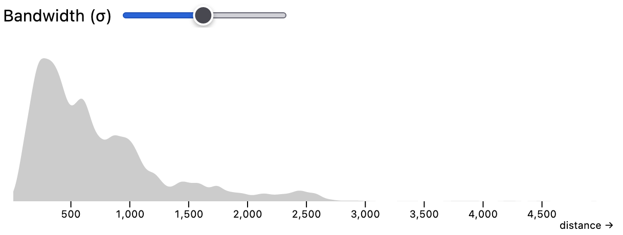
slider are calculated immediately, without having to re-query the database.The densityX/Y marks perform 1D kernel density estimation.
densityY mark, with a slider-bound bandwidth Param.
The generated query() performs linear binning [left
and right
bins are aggregated into a 1D grid, then smoothed in-browser using Deriche’s accurate linear-time approximation [
The density2D, contour, and raster marks compute densities over a 2D domain.
Binning and aggregation are performed in database, while dynamic changes of bandwidth, contour thresholds, and color scales are handled immediately in the browser.
The hexbin mark pushes hexagonal binning and aggregation to the database (count or other aggregate functions.
Rather than point densities, the denseLine mark (query() method pushes line rasterization and aggregation to the database with a multi-part process described in Appendix A.5.
We added the denseLine mark late in our development process to test extensibility, overriding the raster mark with a new query() method.
As a result, the denseLine mark inherits raster’s smoothing capability to create curve density estimates [
Interactors imbue plots with interactive behavior.
Most interactors listen to input events to update bound Selections.
The toggle interactor selects individual points (e.g., by click or shift-click) and generates a selection clause over specified fields of those points.
Other interactors include: nearestX/Y to select the nearest value along the x and/or y channel, intervalX/Y to create 1D or 2D interval brushes (panZoom interactors that produce interval selections over corresponding x or y scale domains (c.f., Vega-Lite [interval interactors accept a pixelSize parameter that sets the brush resolution: values may snap to a grid whose bins are larger than screen pixels, which can be leveraged to optimize query latency (highlight interactor updates the rendered state of a visualization in response to a Selection, querying for a selection bit vector and then modifying unselected items to a translucent, neutral gray color.
Legends can be added to a plot or as a standalone element.
The name directive gives a plot a unique name, which a standalone legend can reference (legendColor({for:'name'})) to avoid respecifying scale domains and ranges.
Legends also act as interactors, taking a bound Selection as a parameter.
For example, discrete legends use the logic of the toggle interactor to enable point selections.
Two-way binding is supported for Selections using single resolution, enabling legends and other interactors to share state, as in
Finally, the layout functions vconcat (vertical concatenation) and hconcat (horizontal concatenation) enable multi-view layout.
Layout helpers can be used with plots, inputs, and arbitrary Web content such as images and videos.
To ensure spacing, the vspace and hspace helpers add padding between elements in a layout.
Declarative Specification
In addition to a JavaScript API, all vgplot constructs, Mosaic inputs, and layout helpers can be authored using a JSON specification format.
YAML, a more human-readable format that maps to JSON, can also be used.
As a result, Mosaic applications can be conveniently generated from other programming languages.
$ prefix. If a Selection is not explicitly defined, one with the intersect resolution strategy is created.Coordinator Optimizations
Mosaic supports query optimization at multiple levels. For optimizations that are specific to a given visualization type (such as M4 for line and area marks), clients can perform local optimizations as part of query generation. The Coordinator, in turn, provides support for optimizations that extend over multiple views and interaction cycles.
Query Caching, Consolidation, and Prefetching
Query caching optimizes for repeated queries. The Coordinator uses a standard LRU cache, storing query results keyed by SQL query text. Future research could explore alternative cache eviction policies that account for latency, dataset size, or other factors. Already, we notice greater benefits for caching than first anticipated: we observe that interactive states are often revisited (even during brushing), and highlight bit vector queries are often shared across plots.
The Coordinator also applies query consolidation, merging overlapping queries into a single query to reduce processing and network time.
As multiple queries tend to be issued in tandem (for example upon initialization), the Coordinator waits one animation frame, collects incoming queries, and merges those that query the same backing table and GROUP BY dimensions.
Upon query completion, the Coordinator parcels out appropriate projections to clients.
Query consolidation is valuable for optimizing multiple views that show data at the same level of aggregation. For example, data for a 4x4 scatter plot matrix requires only 1 consolidated query rather than 16 separate queries.
Prefetching reduces latency by querying data before it is needed.
Clients can issue queries using the Coordinator’s prefetch method.
These requests are enqueued with a lower priority than standard queries.
Prefetched results are then stored in the Coordinator’s cache, available for subsequent requests.
Clients may cancel prefetch requests in response to interactive updates.
As described next, the Coordinator also performs automatic prefetching when building data cube indexes.
Data Cube Indexes
To optimize filtering of aggregated data, the Coordinator automatically builds indexes in the form of small data cubes [query() output.
If generated queries involve group-by aggregation using supported aggregate functions (currently count, sum, avg, min, and max), the Coordinator will rewrite queries to create data cube index tables.
Akin to Falcon [count and sum, including avg, min, and max, in a straightforward way.
For example, given an interval selection over the column $u, the Coordinator uses the number of $pixels and the minimum and maximum possible brush values in the data domain [$bmin, $bmax] to produce pixel-level bins for all possible brush positions.
The following query creates an index table for brush interactions between a linear, one-dimensional selection clause and a single histogram over column $v (with initial value $v0 and bin size $step):
The table name includes a hash of the SELECT statement that creates the table, enabling easy reuse.
If the table already exists it is not re-created.
Upon selection updates, the Coordinator issues queries to the index table.
For data-space brush endpoints $b0 and $b1, the index query is:
The size of the index table is bound by the number of bins (binned $v steps and $pixels), not the size of the input data.
Two-dimensional brushes are handled similarly, resulting in both activeX and activeY index table columns.
To index client queries with subqueries or common table expressions, the indexer performs subquery pushdown of interactive dimensions (e.g., brush pixel bins) so that these values pass from subqueries to the top-level aggregation (see Appendix A.4).
Index tables include bins for each interactive dimension of an active selection clause.
To determine these dimensions, the indexer uses metadata provided by a Selection clause’s schema property.
The schema indicates the abstract predicate type: one of interval or point.
The schema for interval types also includes spatial x/y scale definitions and the interactive pixel size.
Larger interactive pixels lower the interactive resolution, requiring fewer index bins [
Data cube indexes can dramatically reduce interactive latency [hexbin and denseLine filtering over fixed domains (e.g., brushing histograms in
Index construction can sometimes be costly (activate events, which interactors trigger when a pointer enters a view.
Upon activation, the Coordinator submits queries to build index tables before an interval or point selection is initiated.
For longer construction times, the Coordinator and Mosaic DuckDB server can record interactions to precompute bundles of queries and index tables for future use.
Examples
We demonstrate Mosaic’s expressivity and concision through examples.
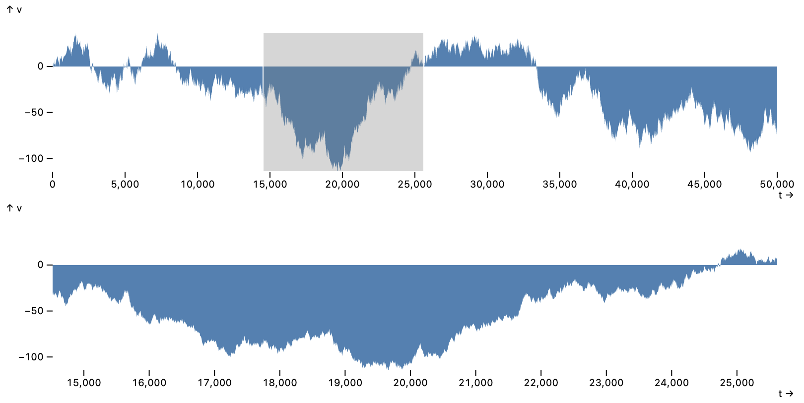
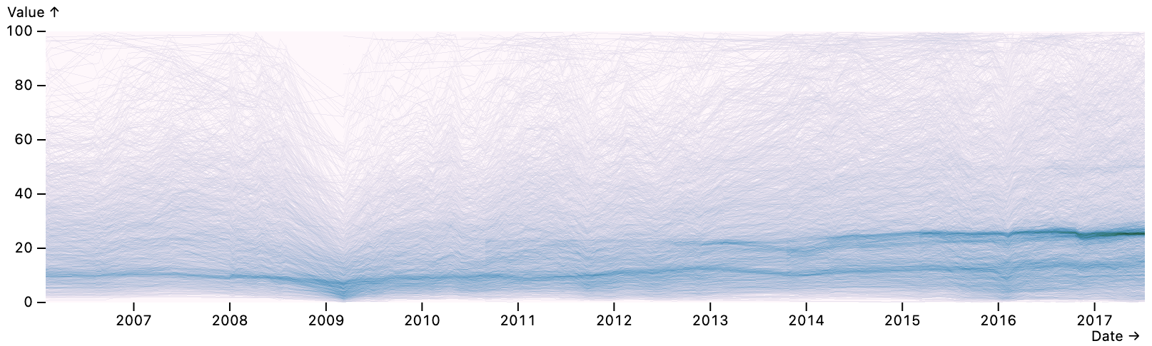
Earlier instances include scalable area charts (
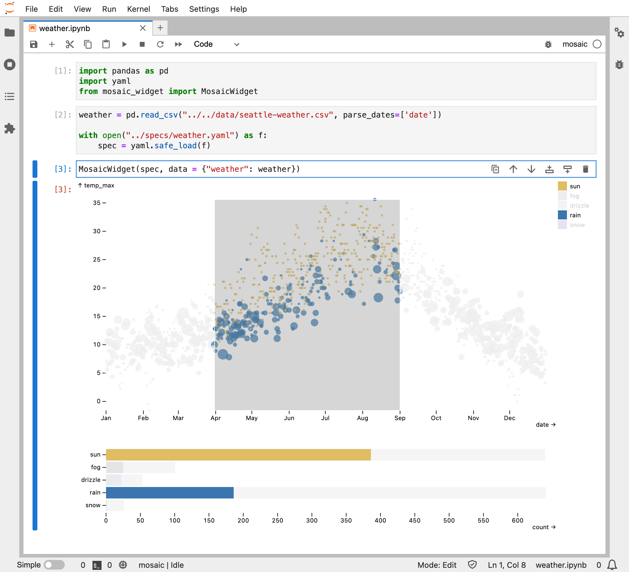
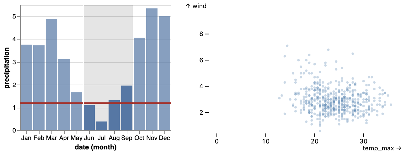
Seattle Weather.
dot mark and intervalX and highlight interactors. The x channel field uses a dateMonthDay transform to map multi-year data to a single year.
The bottom plot uses a barX mark to count days per weather type, with a filterBy selection driven by a selected interval. Both the bars and legend serve as toggle interactors that drive a highlight for the bars and a filterBy selection for the dot above. The legend and barX marks share a selection and update in tandem.
Vega-Lite Integration.
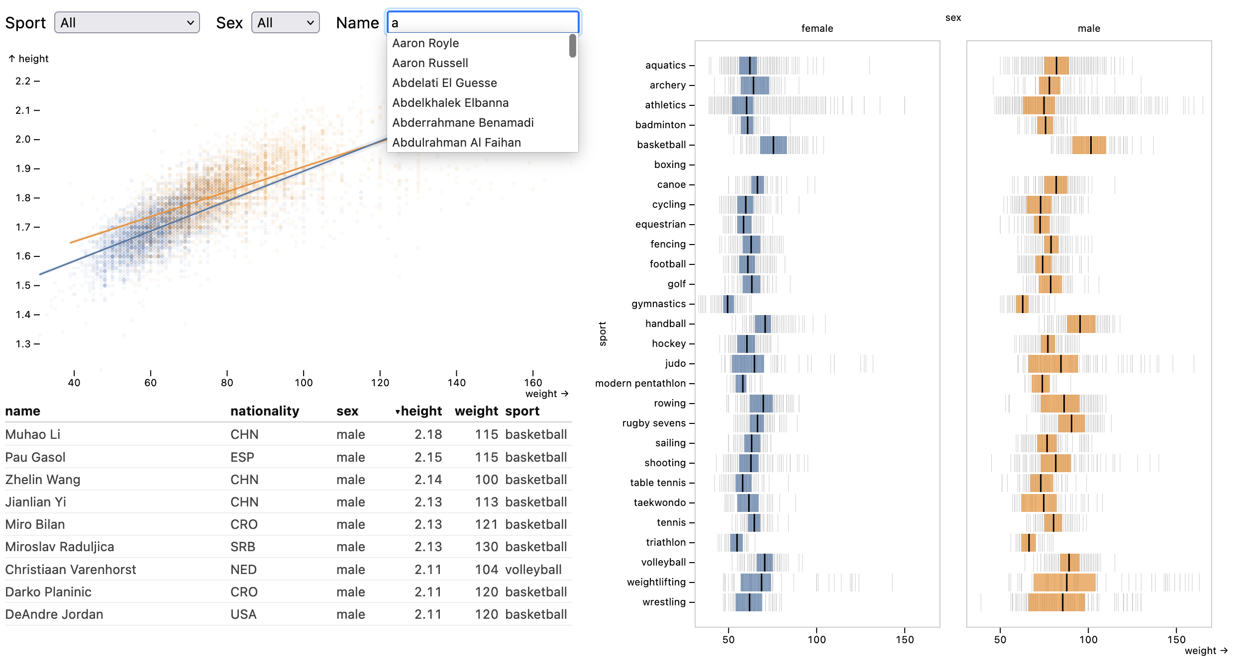
Olympic Athlete Dashboard.
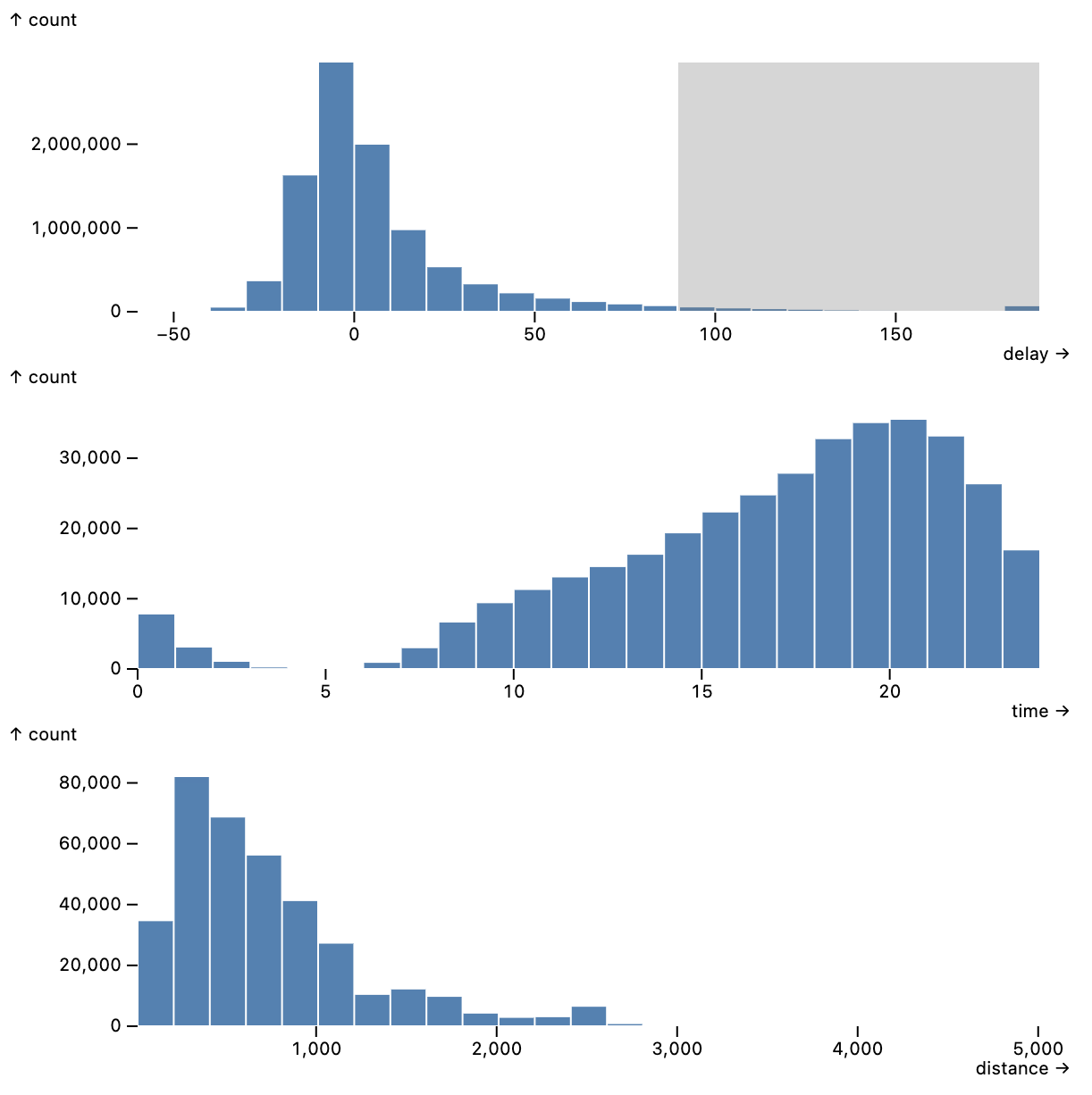
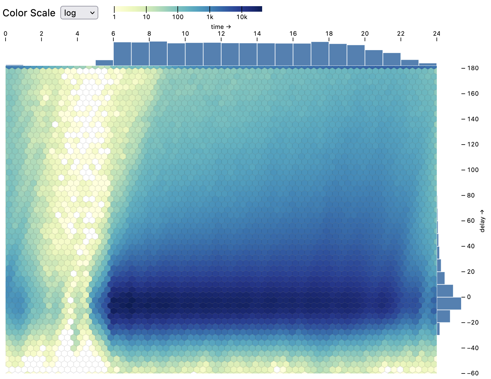
Flight Data.
rectY mark with a bin transform, count aggregate, and a shared filterBy crossfilter selection driven by intervalX brush interactors. Interactive updates are served by data cube indexes.
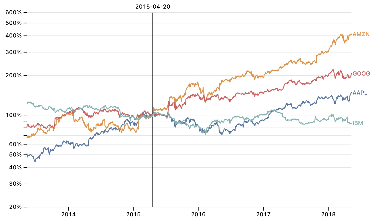
sql template literal.Normalized Stock Prices.
nearestX interactor selects the nearest market day; this value parameterizes a field expression that normalizes prices to show returns if one had invested on that day. Normalization is performed in database by a one-line expression with a scalar subquery. A similar Vega-Lite example requires an extra transform pipeline with a lookup join and derived calculation; the Mosaic version is simpler and more efficient.
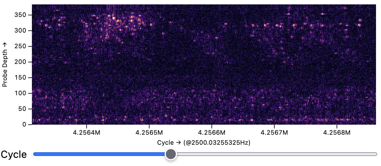
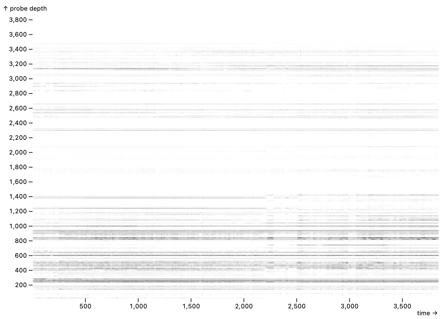
raster over 10.7M time samples (4.1B rows).Neuron Spike Data.
raster of electrical activity measured by our neuroscience collaborators using a probe in a mouse brain.
Measurements of 384 sensor channels across 10.7M time points (4.1B rows) are drawn from an 18GB Parquet file.
To smoothly pan the display, a tiled variant of the raster mark queries adjacent batches of data using the Coordinator prefetch method.
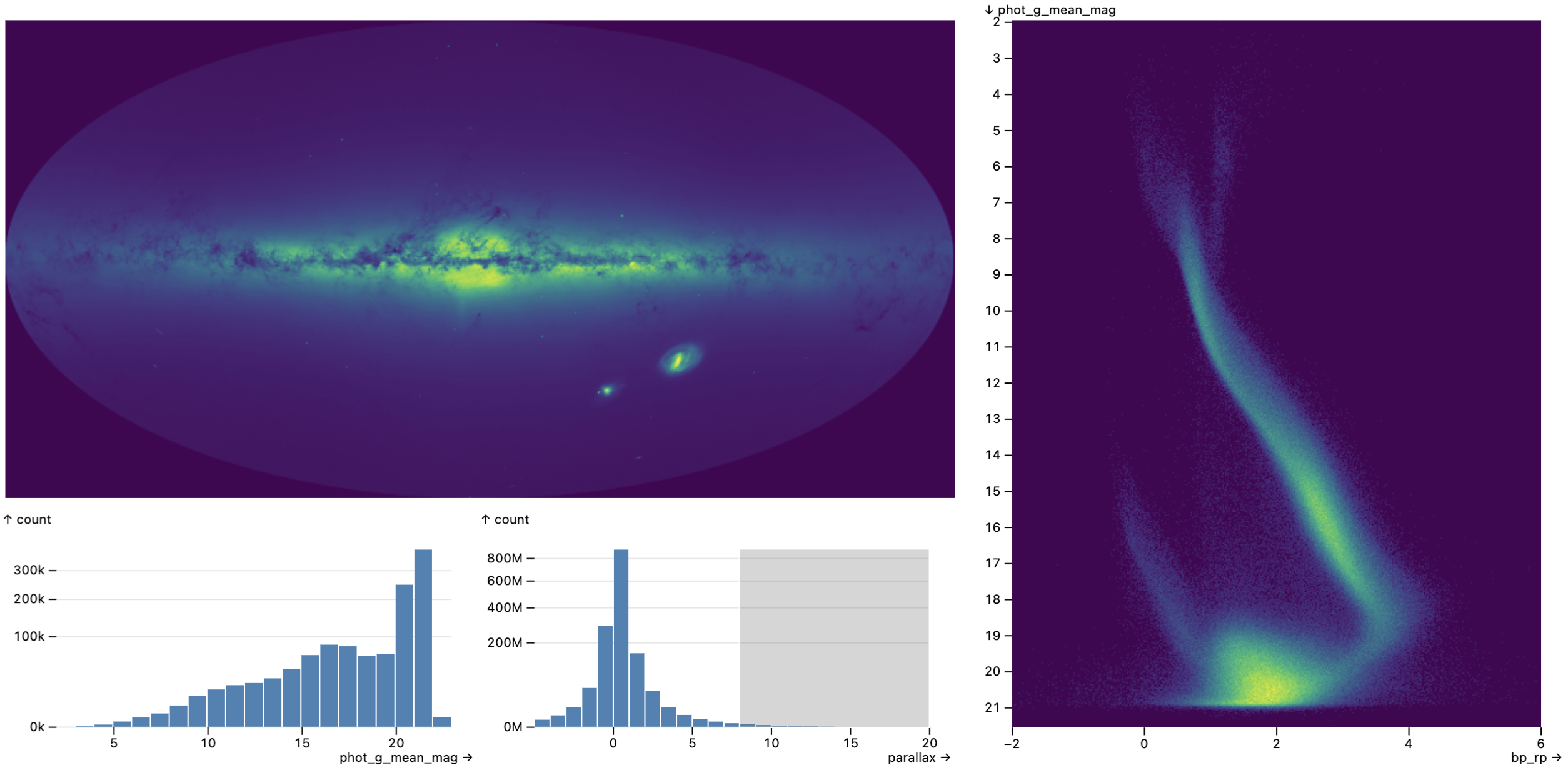
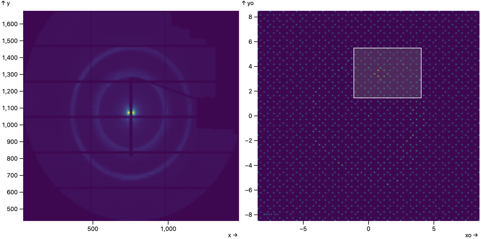
Gaia Star Catalog.
The Gaia star catalog is a sky survey of over 1.8B stars [raster sky map, rectY histograms of magnitude and parallax, and a raster Hertzsprung-Russell diagram of stellar color vs. magnitude.
The map uses the equal-area Hammer projection, performed in the database.
The views are linked by a crossfilter selection driven by interval interactors, automatically optimized by data cube indexes.
Performance Benchmarks
To further assess Mosaic, we conducted performance benchmarks examining both initial rendering and interactive update times. Unless otherwise noted, we ran all benchmarks on a single MacBook Pro laptop (16-inch, 2021) with an Apple M1 Pro processor and 16GB RAM, running MacOS 12.6 and Google Chrome 109.0.5414.119. Server-side DuckDB (v0.6.1) instances used a standard configuration of all processor cores and a maximum of 80% RAM, with network communication over a socket connection and Apache Arrow data transport.
Initial Chart Rendering
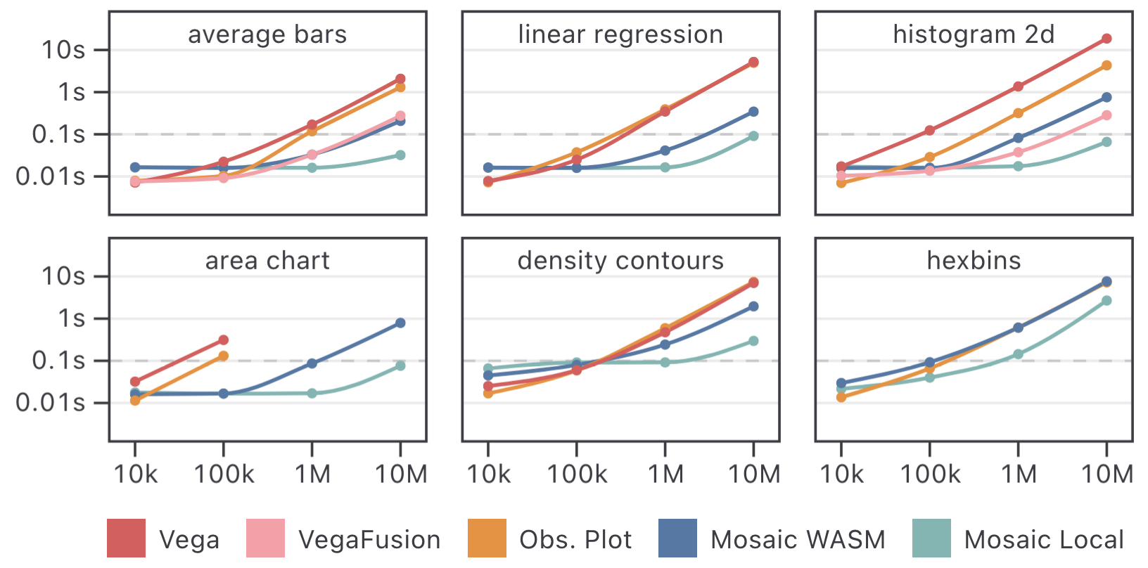
We first compare initial rendering times for Mosaic using either WASM or a local server against Vega [i), a categorical variable of cardinality 20 (w), a uniform random variable (u), and a random walk value (v). We vary the dataset size from 10 thousand to 10 million rows.
We measure render times for six visualizations: bars of average v grouped by w, a linear regression plot of v on i, a 2D histogram binned on u and v, an area chart of v over i, and finally density contours and hexbins over the domain of u and v. We chose these conditions to cover both common visualization needs and a range of scalable visualization types.
Plots in the Vega condition are created using Vega-Lite [
Benchmark results are plotted in
Meanwhile, Mosaic roundly outperforms these tools, often by one or more orders of magnitude. Mosaic WASM fares well at lower data volumes, but at larger sizes is limited by WebAssembly’s lack of parallel processing.
DuckDB aggregate query performance drives Mosaic’s improvements for the bars, regression, 2D histogram, and density contours charts.
The hexbins example benefits from the hexbin mark expressing hexagonal binning calculations within a SQL query.
All non-Mosaic tools fail to render area charts of larger datasets, as Chrome will not draw an SVG path with a million or more points. Here the Mosaic area mark client’s use of M4 enables greater scale, as the number of drawn points is a function of available screen pixels.
Interactive Updates
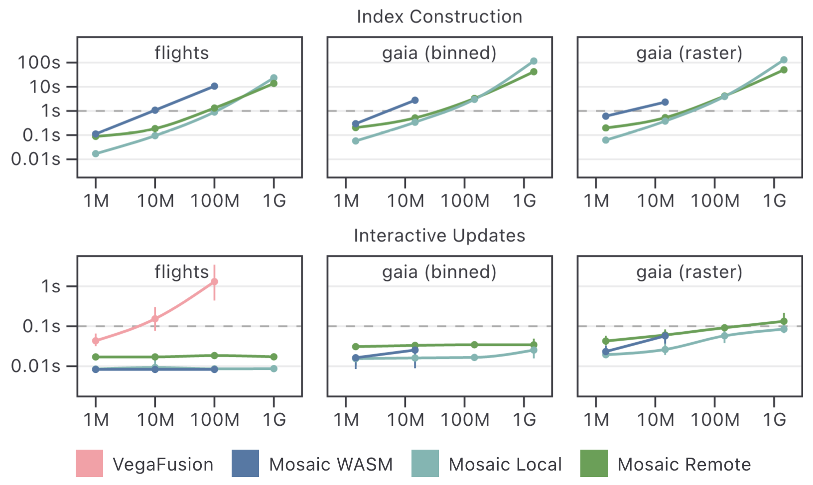
Next we assess interactive performance. We drop the Vega and Observable Plot conditions, as Vega can not handle the dataset sizes tested and Plot does not support interaction. We compare Mosaic using WASM, a local server, and a remote server with 2 12-core 2.6 GHz Intel Xeon processors and 512GB RAM running Rocky Linux 9.1, accessed from 2 miles away over a WiFi router and fiber optic Internet connection.
We measure both data cube index creation and subsequent interactive update times across three real-world applications: the flights dataset (
Across Mosaic conditions, index creation time increases with dataset size. These indexes optimize subsequent updates. In the Gaia raster condition, update times begin to slow as the indexes for cross-filtering between raster displays become large. Here the maximum possible data cube size is 3.6B rows (300x200 interactive pixels times 300x200 raster cells to render). In practice many fewer rows are needed due to sparsity; nevertheless, index sparsity decreases as the dataset size increases. Techniques that materialize a dense index, including imMens [
Discussion
Mosaic is a middle-tier architecture that coordinates interactive data-driven components and scalable data stores. Mosaic Clients publish data needs as declarative queries while interactions are coordinated via dynamic Params and predicate-based Selections. The Mosaic Coordinator mediates between client implementations and data management, while performing automatic query optimization. We demonstrate interactive exploration of large-scale data using Mosaic-based input widgets and vgplot, a grammar of interactive graphics. A range of examples highlight Mosaic’s extensibility and interoperability, while performance benchmarks show significant scalability and interactive performance improvements over existing web-based visualization tools.
Whereas prior work on scalable visualization has largely contributed individual techniques, Mosaic provides a framework that integrates databases, query optimization, and an expressive set of visualization abstractions within a unified system. The Mosaic Coordinator provides automatic optimizations such as caching, query consolidation, and data cube indexes, while individual clients can perform local optimizations (such as M4 or Coordinator-assisted prefetching) based on known visualization or interaction semantics. The vgplot library also illustrates how many visualization transforms (including a variety of density displays) can be implemented as database queries.
One limitation is the time required to build indexes for larger (500M+ row) datasets.
Rather than assume a cold start
, Mosaic also supports index precomputation; at most a few minutes are needed for the full Gaia catalog.
Slower interactive updates are partially compensated by Mosaic’s event throttling: one can interact in real-time (e.g., adjust brushes) though the data may update after a short but noticeable delay.
As noted earlier, Mosaic also supports reducing interactive resolution [
Moreover, we have found it valuable to adjust the sample level during exploration, navigating under low latency with a smaller sample, then switching to a large sample to gain resolution and detail.
In this way, Mosaic leverages both sampling and binned aggregation akin to Moritz et al.’s optimistic visualization [
While Observable Plot has proven a convenient renderer for vgplot, it does not yet support incremental rendering, slowing updates involving many unchanged graphical elements. For fast drawing of 100k+ data points, future Mosaic clients could use hardware accelerated rendering. In addition, operations such as graph layout and cartographic transformations can be difficult or inefficient to implement in terms of database queries. While they can instead be performed in-browser, ultimately we would like to provide scalable support. As DuckDB is an extensible, open source engine, future extensions might better support GIS or specialized visualization workloads. Future Mosaic Coordinator implementations could also federate query processing across standard SQL databases and alternative engines.
A fundamental question here concerns how data transformation and visual encoding are best partitioned among a database and clients [hexbin mark query performs a screen space mapping and then maps back to data space for consistency and integration with Observable Plot.
Cartographic projection is particularly challenging, as not all projections are invertible, preventing scale inversion from screen space to data space.
For projected maps, linked selection queries are better supported using post-projection coordinates, as in the Gaia example of encoding
transforms between the database and browser.
Going forward, we hope that Mosaic can serve as an open platform to develop and deploy scalable, interactive data exploration methods. We carefully designed the Mosaic Coordinator to decouple component implementations from data management, with the goal of making it easier for database specialists and visualization/UI specialists to contribute to separate parts of the system. Mosaic can be extended with new client components (or entire component libraries), while vgplot can be extended with new marks or interactors, as is appropriate.
One area of future work is to further integrate Mosaic with other systems.
As previously noted, Mosaic can serve as a testbed for improved query caching, indexing, and other optimization methods.
By logging queries and selections, Mosaic can also assist empirical research into data exploration workloads and user modeling [
Acknowledgments
We thank the UW Interactive Data Lab for their suggestions and feedback. This work was supported by the Moore Foundation.
Query Generation & Date Cube Indexes
Here we further detail how vgplot mark clients generate queries and how the Coordinator performs data cube indexing.
Basic Marks
Each vgplot mark is as a Mosaic client that generates queries.
The Coordinator invokes the client query() method and manages the returned query.
Basic mark types use a straightforward query generation procedure.
For example, consider a standard scatter plot (dot mark) with x, y, and r (radius size) encodings.
For a backing data table $table and corresponding table columns denoted as $u, $v, and $w, the mark query() method returns a query that selects the data directly:
Subsequent visual encoding—such as mapping the data through scale transforms—is performed in the browser.
Mark clients may also have a filterBy Selection property, which if set, is used to generate a predicate that is passed as the filter argument to the mark query() method.
For basic marks, the filter predicate is appended as a SQL WHERE clause.
Given an interval selection for column $b over the domain [$b0, $b1], the following query is produced:
If a mark encoding involves an aggregate operation, the non-aggregated fields are included as SQL GROUP BY criteria.
Consider a bar chart (barY mark) that, for an ordinal column $a on the x-axis, shows the average values of columnn $b on the y-axis:
Connected Marks and M4 Optimization
Connected marks such as lineX/Y and areaX/Y can be further optimized.
Consider the area charts in $table with column $t visualized along the x-axis and column $v along the y-axis,
the basic query generation method above would select all data points:
We can do better by applying shape-preserving, pixel-aware binning using the M4 method [$w and minimum and maximum plotted $t values $t0 and $t1,
the optimized query used by Mosaic takes the form:
For each pixel, M4 selects the extremal $t and $v values—two minimums and two maximums, hence M4
. The resulting output data has at most four points per pixel.
We use the AM4
variant of M4 [ARG_MIN and ARG_MAX aggregates to select a matching co-ordinate for each extremum.
Linear Binning
The densityX and densityY marks visualize kernel density estimates.
To produce these estimates in a scalable manner, we use an approximation that first bins the data points into a grid.
We perform linear binning [
To bin column $v linearly into $n bins over the domain [$v0, $v1], we use a query with two subqueries—one for the left
bin and one for the right
bin—and aggregate the results of their union:
The return value is a one-dimensional grid of binned values, with an integer index and corresponding weight.
To generate two-dimensional densities, we perform linear binning in 2D using an analogous procedure involving four subqueries.
Subsequent smoothing is performed in the browser using Deriche’s linear time approximation [
Binned Aggregation and Data Cube Indexes
rectY mark), we use a bin transform on the x encoding channel and a count aggregate for the y channel.
The bin transform provides an expression generator function that is called by the basic mark query generation procedure.
The query for a single histogram of column $v over the domain [$v0, $v1] is:
To cross-filter, each mark has a filterBy Selection that produces predicates driven by selection brushes (intervalX interactors).
As above, the default query generation procedure adds those predicates to a SQL WHERE clause.
For an interval brush selection [$b0, $b1] over the column $u, the resulting query for a cross-filtered histogram is:
If data cube indexing is enabled, these queries are automatically optimized by the Coordinator, in a fashion completely decoupled from the mark itself.
If generated queries involve group-by aggregation using supported aggregate functions (currently count, sum, avg, min, and max), the Coordinator will rewrite the query to create a multivariate data tile [
For an interval selection over the column $u, the Coordinator uses the number of $pixels and the minimum and maximum possible brush values in the data domain [$bmin, $bmax] to produce pixel-level bins for all possible brush positions.
The following query creates a data cube for brush interactions between a one-dimensional active selection clause and a single histogram:
Upon selection updates, the Coordinator issues queries to the data cube index
rather than use the basic filtered query described previously.
Given data-space brush endpoints $b0 and $b1, the index query is:
The size of the data cube is bound by the number of bins (binned $v steps and the number of $pixels), not the size of the input data.
As a result, for large datasets the data cube index queries can be computed substantially faster [activeX and activeY index columns.
Data cube indexes can be created for complex queries involving subqueries or common table expressions (CTEs).
In such cases, the Coordinator walks the query tree and performs pushdown of active selection columns.
In the densityY query below, the column $u is pushed down into the subqueries and then pixel-binned by the outer query.
Subsequent index queries thus amortize the cost of both interactive updates and the original, complex aggregation.
Line Density
Density mark calculations can use either the linear binning method described above or standard binning, in which the mass
of point is allocated to a single bin only.
However, these methods apply to point data only.
Density line charts [denseLine mark subclasses vgplot’s raster mark, generating an alternative query that performs line rasterization and normalization in the database to produce line densities.
As shown below, the generated query is complex and consists of multiple processing steps specified as common table expressions (CTEs). The key steps are: (1) bin data points to raster grid coordinates (source subquery), (2) identify line segments as start points and delta offsets (pairs subquery), (3) compute integer indices up to the maximum line segment run or rise (in raster bins, indices subquery), (4) join the line segments and indices to perform line rasterization (raster subquery), (5) normalize column weights for each series to approximate arc-length normalization [points subquery), and (6) aggregate all density values into an output grid (outer query).
In the query above, $x and $y correspond to input columns mapped to spatial dimensions (over the domains [$x0, $x1] and [$y0, $y1]), while $z is a categorical variable indicating different line series and $width is the width of the output grid in raster cells.
The resulting grid of line densities can optionally be smoothed in the browser, using the inherited functionality of the raster mark.
Additional Examples
Here we share additional examples of Mosaic applications, supplementing the examples presented in
Neuron Spike Measurements
We apply Mosaic to data from neuroscience collaborators.
raster density map of algorithmically extracted neuron spikes from a single experimental run, consisting of 8.3M rows in a 95MB Parquet file.
A panZoom interactor enables real-time panning and zooming.
Our collaborators were excited that we were able to write Mosaic code within just a few minutes to visualize and interact with their data. Their current workflow involves long-running batch processes to generate static images for each experimental session. With Mosaic, we are able to provide real-time interactive visualizations on-demand. We are now working jointly on richer dashboards for examining the results across many experimental runs.
X-Ray Scatter Images
Here Mosaic visualizes data from beamline X-ray scattering experiments that help understand physical materials’ properties.
Zoomable Gaia Sky Map
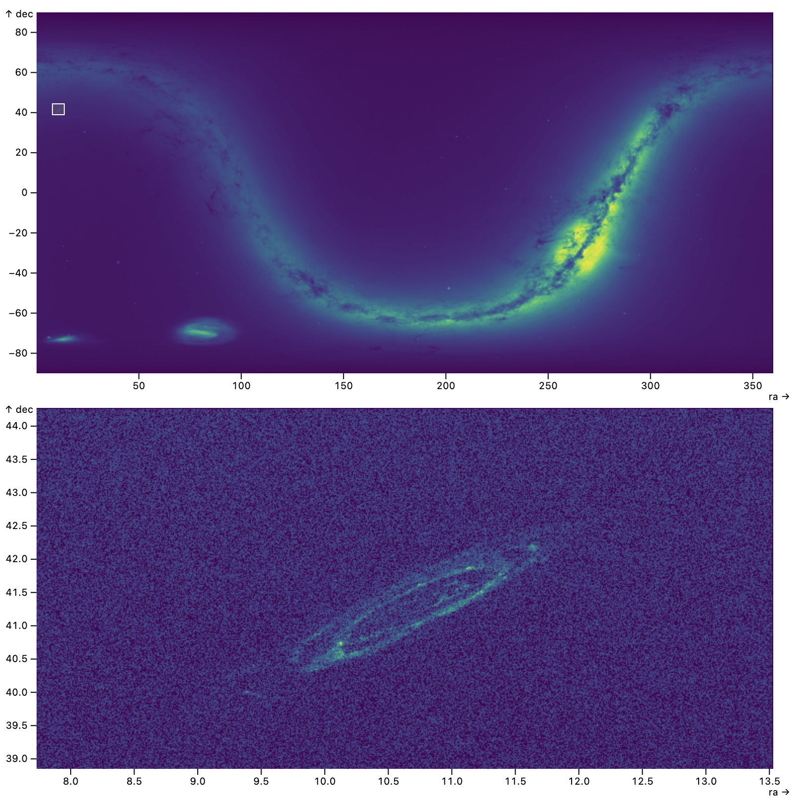
In addition to the Gaia dashboard of ra) and declination (dec) coordinates are plotted directly.
Brushing in the overview region produces a zoomed-in view in the detail panel.
A patch of sky is selected in
References
- Apache Arrow. (n.d.). https://arrow.apache.org/
- Battle, L., Chang, R., & Stonebraker, M. (2016, June 14). Dynamic Prefetching of Data Tiles for Interactive Visualization. Proceedings of the 2016 International Conference on Management of Data. SIGMOD/PODS’16: International Conference on Management of Data. https://doi.org/10.1145/2882903.2882919
- Battle, L., Eichmann, P., Angelini, M., Catarci, T., Santucci, G., Zheng, Y., Binnig, C., Fekete, J.-D., & Moritz, D. (2020, May 31). Database Benchmarking for Supporting Real-Time Interactive Querying of Large Data. Proceedings of the 2020 ACM SIGMOD International Conference on Management of Data. SIGMOD/PODS ’20: International Conference on Management of Data. https://doi.org/10.1145/3318464.3389732
- Battle, L., & Scheidegger, C. (2021). A Structured Review of Data Management Technology for Interactive Visualization and Analysis. IEEE Transactions on Visualization and Computer Graphics, 27(2), 1128–1138. https://doi.org/10.1109/tvcg.2020.3028891
- Bostock, M., Ogievetsky, V., & Heer, J. (2011). D³ Data-Driven Documents. IEEE Transactions on Visualization and Computer Graphics, 17(12), 2301–2309. https://doi.org/10.1109/tvcg.2011.185
- Bureau of Transportation Statistics. (n.d.). On-Time Performance. https://www.bts.gov/
- Carr, D. B., Littlefield, R. J., Nicholson, W. L., & Littlefield, J. S. (1987). Scatterplot Matrix Techniques for LargeN. Journal of the American Statistical Association, 82(398), 424–436. https://doi.org/10.1080/01621459.1987.10478445
- Chen, R., Shu, X., Chen, J., Weng, D., Tang, J., Fu, S., & Wu, Y. (2022). Nebula: A Coordinating Grammar of Graphics. IEEE Transactions on Visualization and Computer Graphics, 28(12), 4127–4140. https://doi.org/10.1109/tvcg.2021.3076222
- Chen, Y., & Wu, E. (2022, June 10). PI2: End-to-end Interactive Visualization Interface Generation from Queries. Proceedings of the 2022 International Conference on Management of Data. SIGMOD/PODS ’22: International Conference on Management of Data. https://doi.org/10.1145/3514221.3526166
- Crow, F. C. (1984). Summed-area tables for texture mapping. ACM SIGGRAPH Computer Graphics, 18(3), 207–212. https://doi.org/10.1145/964965.808600
- Deriche, R. (1993). Recursively implementing the Gaussian and its derivatives [Techreport]. INRIA. http://hal.inria.fr/docs/00/07/47/78/PDF/RR-1893.pdf
- Gaia Collaboration, Vallenari, A., Brown, A. G. A., & 453 others. (2022). Gaia Data Release 3: Summary of the content and survey properties. https://doi.org/10.48550/arXiv.2208.00211
- Glue: multi-dimensional linked-data exploration. (n.d.). https://glueviz.org/
- Gray, J., Chaudhuri, S., Bosworth, A., Layman, A., Reichart, D., Venkatrao, M., Pellow, F., & Pirahesh, H. (1997). Data cube: A relational aggregation operator generalizing group-by, cross-tab, and sub-totals. Data Mining and Knowledge Discovery, 1, 29–53.
- Heer, J. (2021, October). Fast & Accurate Gaussian Kernel Density Estimation. 2021 IEEE Visualization Conference (VIS). 2021 IEEE Visualization Conference (VIS). https://doi.org/10.1109/vis49827.2021.9623323
- Jones, M. C., & Lotwick, H. W. (1983). On the errors involved in computing the empirical characteristic function. Journal of Statistical Computation and Simulation, 17(2), 133–149. https://doi.org/10.1080/00949658308810650
- Jugel, U., Jerzak, Z., Hackenbroich, G., & Markl, V. (2014). M4. Proceedings of the VLDB Endowment, 7(10), 797–808. https://doi.org/10.14778/2732951.2732953
- Kohn, A., Moritz, D., Raasveldt, M., Mühleisen, H., & Neumann, T. (2022). DuckDB-wasm. Proceedings of the VLDB Endowment, 15(12), 3574–3577. https://doi.org/10.14778/3554821.3554847
- Kohn, A., Moritz, D., & Neumann, T. (2023). DashQL – Complete Analysis Workflows with SQL. https://doi.org/10.48550/ARXIV.2306.03714
- Kruchten, N., Mease, J., & Moritz, D. (2022, October). VegaFusion: Automatic Server-Side Scaling for Interactive Vega Visualizations. 2022 IEEE Visualization and Visual Analytics (VIS). 2022 IEEE Visualization and Visual Analytics (VIS). https://doi.org/10.1109/vis54862.2022.00011
- Lampe, O. D., & Hauser, H. (2011). Curve Density Estimates. Computer Graphics Forum, 30(3), 633–642. https://doi.org/10.1111/j.1467-8659.2011.01912.x
- Lins, L., Klosowski, J. T., & Scheidegger, C. (2013). Nanocubes for Real-Time Exploration of Spatiotemporal Datasets. IEEE Transactions on Visualization and Computer Graphics, 19(12), 2456–2465. https://doi.org/10.1109/tvcg.2013.179
- Liu, Z., Jiang, B., & Heer, J. (2013). imMens: Real‐time Visual Querying of Big Data. Computer Graphics Forum, 32(3pt4), 421–430. https://doi.org/10.1111/cgf.12129
- Livny, M., Ramakrishnan, R., Beyer, K., Chen, G., Donjerkovic, D., Lawande, S., Myllymaki, J., & Wenger, K. (1997). DEVise. ACM SIGMOD Record, 26(2), 301–312. https://doi.org/10.1145/253262.253335
- Mohammed, H., Wei, Z., Wu, E., & Netravali, R. (2020). Continuous prefetch for interactive data applications. Proceedings of the VLDB Endowment, 13(12), 2297–2311. https://doi.org/10.14778/3407790.3407826
- Moritz, D., Heer, J., & Howe, B. (2015). Dynamic Client-Server Optimization for Scalable Interactive Visualization on the Web. IEEE VIS Data Systems for Interactive Analysis (DSIA) Workshop.
- Moritz, D., Fisher, D., Ding, B., & Wang, C. (2017, May 2). Trust, but Verify: Optimistic Visualizations of Approximate Queries for Exploring Big Data. Proceedings of the 2017 CHI Conference on Human Factors in Computing Systems. CHI ’17: CHI Conference on Human Factors in Computing Systems. https://doi.org/10.1145/3025453.3025456
- Moritz, D., & Fisher, D. (2018). Visualizing a Million Time Series with the Density Line Chart (Version 2). arXiv. https://doi.org/10.48550/ARXIV.1808.06019
- Moritz, D., Howe, B., & Heer, J. (2019, May 2). Falcon. Proceedings of the 2019 CHI Conference on Human Factors in Computing Systems. CHI ’19: CHI Conference on Human Factors in Computing Systems. https://doi.org/10.1145/3290605.3300924
- Moritz, D., Wang, C., Nelson, G. L., Lin, H., Smith, A. M., Howe, B., & Heer, J. (2019). Formalizing Visualization Design Knowledge as Constraints: Actionable and Extensible Models in Draco. IEEE Transactions on Visualization and Computer Graphics, 25(1), 438–448. https://doi.org/10.1109/tvcg.2018.2865240
- North, C., & Shneiderman, B. (2000, May). Snap-together visualization. Proceedings of the Working Conference on Advanced Visual Interfaces. AVI00: Advanced Visual Interfaces. https://doi.org/10.1145/345513.345282
- Observable Plot. (n.d.). https://github.com/observablehq/plot
- Observable Inputs. (n.d.). https://github.com/observablehq/inputs
- Raasveldt, M., & Mühleisen, H. (2019, June 25). DuckDB. Proceedings of the 2019 International Conference on Management of Data. SIGMOD/PODS ’19: International Conference on Management of Data. https://doi.org/10.1145/3299869.3320212
- Satyanarayan, A., Russell, R., Hoffswell, J., & Heer, J. (2016). Reactive Vega: A Streaming Dataflow Architecture for Declarative Interactive Visualization. IEEE Transactions on Visualization and Computer Graphics, 22(1), 659–668. https://doi.org/10.1109/tvcg.2015.2467091
- Satyanarayan, A., Moritz, D., Wongsuphasawat, K., & Heer, J. (2017). Vega-Lite: A Grammar of Interactive Graphics. IEEE Transactions on Visualization and Computer Graphics, 23(1), 341–350. https://doi.org/10.1109/tvcg.2016.2599030
- Stolte, C., Tang, D., & Hanrahan, P. (2002). Polaris: a system for query, analysis, and visualization of multidimensional relational databases. IEEE Transactions on Visualization and Computer Graphics, 8(1), 52–65. https://doi.org/10.1109/2945.981851
- Tao, W., Liu, X., Wang, Y., Battle, L., Demiralp, Ç., Chang, R., & Stonebraker, M. (2019). Kyrix: Interactive Pan/Zoom Visualizations at Scale. Computer Graphics Forum, 38(3), 529–540. https://doi.org/10.1111/cgf.13708
- Tao, W., Hou, X., Sah, A., Battle, L., Chang, R., & Stonebraker, M. (2021). Kyrix-S: Authoring Scalable Scatterplot Visualizations of Big Data. IEEE Transactions on Visualization and Computer Graphics, 27(2), 401–411. https://doi.org/10.1109/tvcg.2020.3030372
- VanderPlas, J., Granger, B., Heer, J., Moritz, D., Wongsuphasawat, K., Satyanarayan, A., Lees, E., Timofeev, I., Welsh, B., & Sievert, S. (2018). Altair: Interactive Statistical Visualizations for Python. Journal of Open Source Software, 3(32), 1057. https://doi.org/10.21105/joss.01057
- Wand, M. P. (1994). Fast Computation of Multivariate Kernel Estimators. Journal of Computational and Graphical Statistics, 3(4), 433. https://doi.org/10.2307/1390904
- Weaver, C. (n.d.). Building Highly-Coordinated Visualizations in Improvise. IEEE Symposium on Information Visualization. IEEE Symposium on Information Visualization. https://doi.org/10.1109/infvis.2004.12
- Wickham, H. (2010). A Layered Grammar of Graphics. Journal of Computational and Graphical Statistics, 19(1), 3–28. https://doi.org/10.1198/jcgs.2009.07098
- Wickham, H. (2013). Bin-summarise-smooth: A framework for visualising large data. In had.co.nz, Tech. Rep [Techreport]. http://vita.had.co.nz/papers/bigvis.pdf
- Wilkinson, L. (2011). The Grammar of Graphics. In Handbook of Computational Statistics (pp. 375–414). Springer Berlin Heidelberg. https://doi.org/10.1007/978-3-642-21551-3_13
- Wongsuphasawat, K., Moritz, D., Anand, A., Mackinlay, J., Howe, B., & Heer, J. (2016). Voyager: Exploratory Analysis via Faceted Browsing of Visualization Recommendations. IEEE Transactions on Visualization and Computer Graphics, 22(1), 649–658. https://doi.org/10.1109/tvcg.2015.2467191
- Wu, E., Battle, L., & Madden, S. R. (2014). The case for data visualization management systems. Proceedings of the VLDB Endowment, 7(10), 903–906. https://doi.org/10.14778/2732951.2732964
- Wu, Y., Chang, R., Hellerstein, J. M., Satyanarayan, A., & Wu, E. (2022). DIEL: Interactive Visualization Beyond the Here and Now. IEEE Transactions on Visualization and Computer Graphics, 28(1), 737–746. https://doi.org/10.1109/tvcg.2021.3114796
- Yang, J., Joo, H. K., Yerramreddy, S. S., Li, S., Moritz, D., & Battle, L. (2022, June 10). Demonstration of VegaPlus: Optimizing Declarative Visualization Languages. Proceedings of the 2022 International Conference on Management of Data. SIGMOD/PODS ’22: International Conference on Management of Data. https://doi.org/10.1145/3514221.3520168