Computer Graphics Forum (Proc. EuroVis), 2018
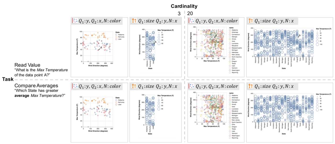
A subset of experiment stimuli across tasks (Read Value and Compare Averages) and cardinalities (3, 20). Each stimulus is labeled with its mapping from data fields (Q1, Q2, N) to visual channels (x, y, color, size).
Abstract
In addition to the choice of visual encodings, the effectiveness of a data visualization may vary with the analytical task being performed and the distribution of data values. To better assess these effects and create refined rankings of visual encodings, we conduct an experiment measuring subject performance across task types (e.g., comparing individual versus aggregate values) and data distributions (e.g., with varied cardinalities and entropies). We compare performance across 12 encoding specifications of trivariate data involving 1 categorical and 2 quantitative fields, including the use of x, y, color, size, and spatial subdivision (i.e., faceting). Our results extend existing models of encoding effectiveness and suggest improved approaches for automated design. For example, we find that colored scatterplots (with positionally-coded quantities and color-coded categories) perform well for comparing individual points, but perform poorly for summary tasks as the number of categories increases.
Citation