Abstract
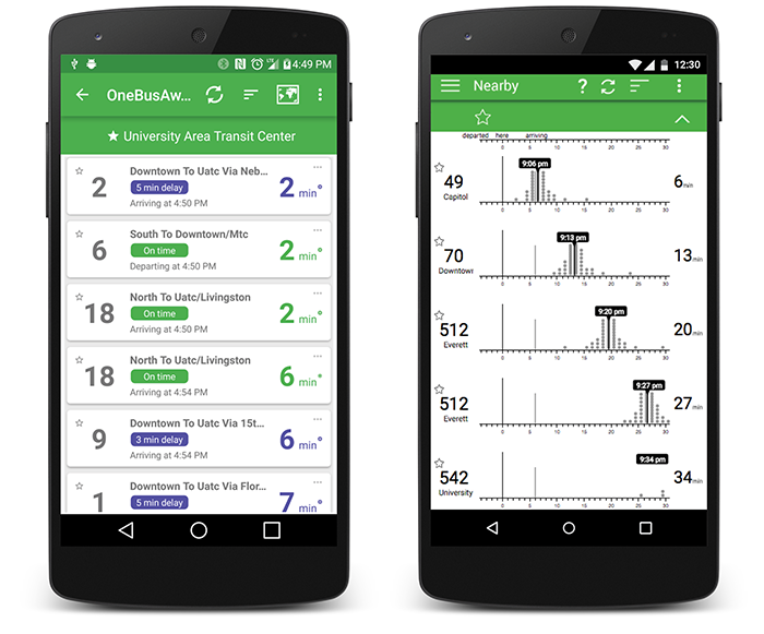
Everyday predictive systems typically present point predictions, making it hard for people to account for uncertainty when making decisions. Evaluations of uncertainty displays for transit prediction have assessed people’s ability to extract probabilities, but not the quality of their decisions. In a controlled, incentivized experiment, we had subjects decide when to catch a bus using displays with textual uncertainty, uncertainty visualizations, or no-uncertainty (control). Frequency-based visualizations previously shown to allow people to better extract probabilities (quantile dotplots) yielded better decisions. Decisions with quantile dotplots with 50 outcomes were (1) better on average, having expected payoffs 97% of optimal (95% CI: [95%,98%]), 5 percentage points more than control (95% CI: [2,8]); and (2) more consistent, having within-subject standard deviation of 3 percentage points (95% CI: [2,4]), 4 percentage points less than control (95% CI: [2,6]). Cumulative distribution function plots performed nearly as well, and both outperformed textual uncertainty, which was sensitive to the probability interval communicated. We discuss implications for realtime transit predictions and possible generalization to other domains.
