IEEE Trans. Visualization & Comp. Graphics (Proc. VIS), 2024
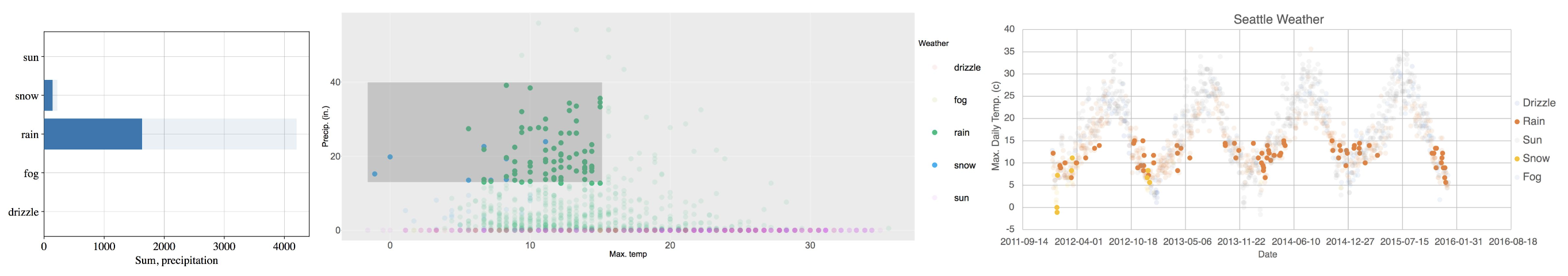
Automatic multi-view, cross-tool interactions with DIVI. Dynamically interactive charts of Seattle weather data, from left to right: Matplotlib bar chart (weather vs. sum(precip)), ggplot2 scatter plot (temp_max vs. precip), and Excel scatter plot (date vs. temp_max). DIVI automatically deconstructs charts to identify semantic components and coordinate user input. Here DIVI links temp_max and weather between scatter plots, and also leverages the source dataset to infer bar chart aggregation of sum(precip) over weather. Interactions are linked: the user brushes an area in the ggplot2 scatter plot with low temp_max and high precip, re-aggregating the bar chart and propagating the selection to the Excel scatter plot to indicate seasonal wintry periods.
Abstract
Dynamically Interactive Visualization (DIVI) is a novel approach for orchestrating interactions within and across static visualizations. DIVI deconstructs Scalable Vector Graphics charts at runtime to infer content and coordinate user input, decoupling interaction from specification logic. This decoupling allows interactions to extend and compose freely across different tools, chart types, and analysis goals. DIVI exploits positional relations of marks to detect chart components such as axes and legends, reconstruct scales and view encodings, and infer data fields. DIVI then enumerates candidate transformations across inferred data to perform linking between views. To support dynamic interaction without prior specification, we introduce a taxonomy that formalizes the space of standard interactions by chart element, interaction type, and input event. We demonstrate DIVI’s usefulness for rapid data exploration and analysis through a usability study with 13 participants and a diverse gallery of dynamically interactive visualizations, including single chart, multi-view, and cross-tool configurations.
Citation